
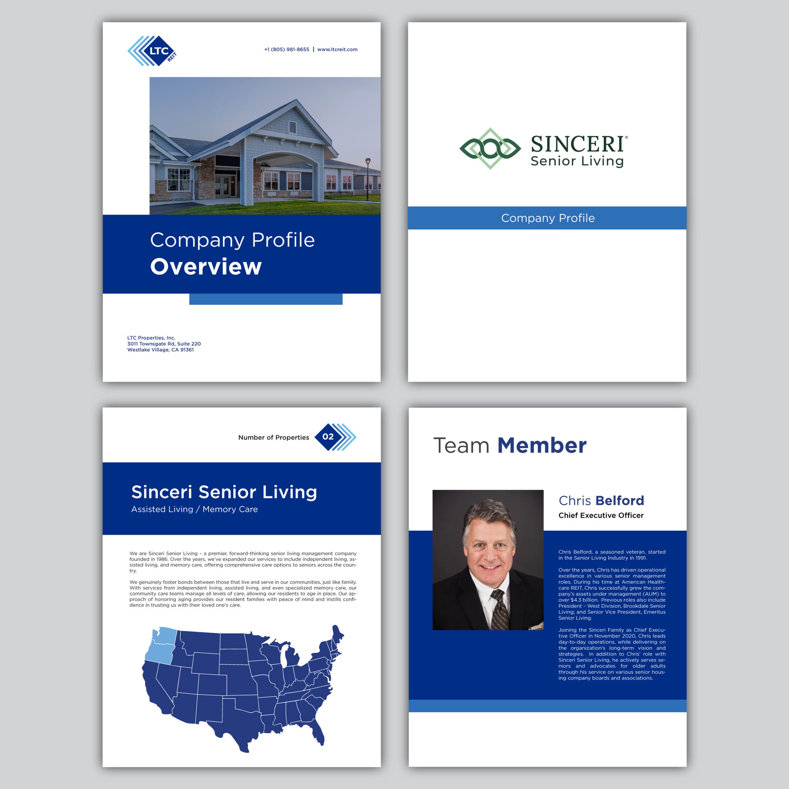
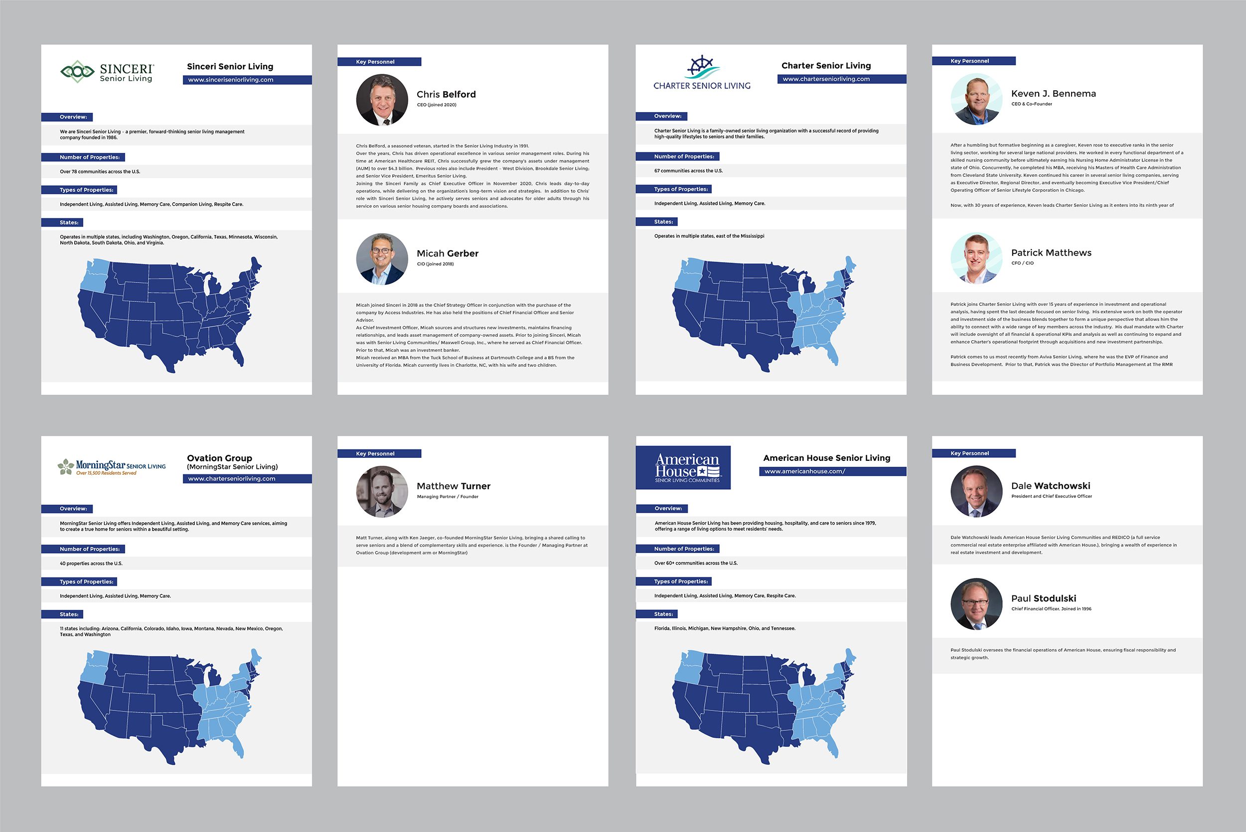
LTC Properties, Inc. (NYSE: LTC), a leading real estate investment trust focused on senior housing and healthcare properties, approached me to design a clean, professional company profile brochure. This document was intended for internal distribution and was to be presented by their team during meetings at an elderly care conference.
The client required a reformatting of their existing content into a more consistent and brand-aligned layout. The goal was clarity, professionalism, and easy post-delivery editing. Working within Microsoft Word ensured the final output could be adjusted as needed by their in-house team.
Key goals for this project:
Maintain a modern, elegant tone
Use a sans-serif font for clarity and consistency
Deliver a layout that is editable, print-friendly, and visually aligned with LTC REIT’s branding
Balance corporate seriousness with approachability for effective communication during key industry meetings
The final result is a refined, on-brand brochure that helps LTC’s team deliver a clear message to potential partners in elderly care facilities across the U.S.
Brief Analysis: Assessed the original document for formatting inconsistencies and understood the audience—internal use for senior team members.
Design Direction: Aligned with LTC REIT’s branding: modern, elegant, professional, and conservative.
Typography & Layout: Applied a clean sans-serif font across all content; ensured headings, subheadings, and body text followed a consistent hierarchy.
Final Output: Delivered an editable, polished Word document and a PDF version, ready for immediate use in high-level meetings.