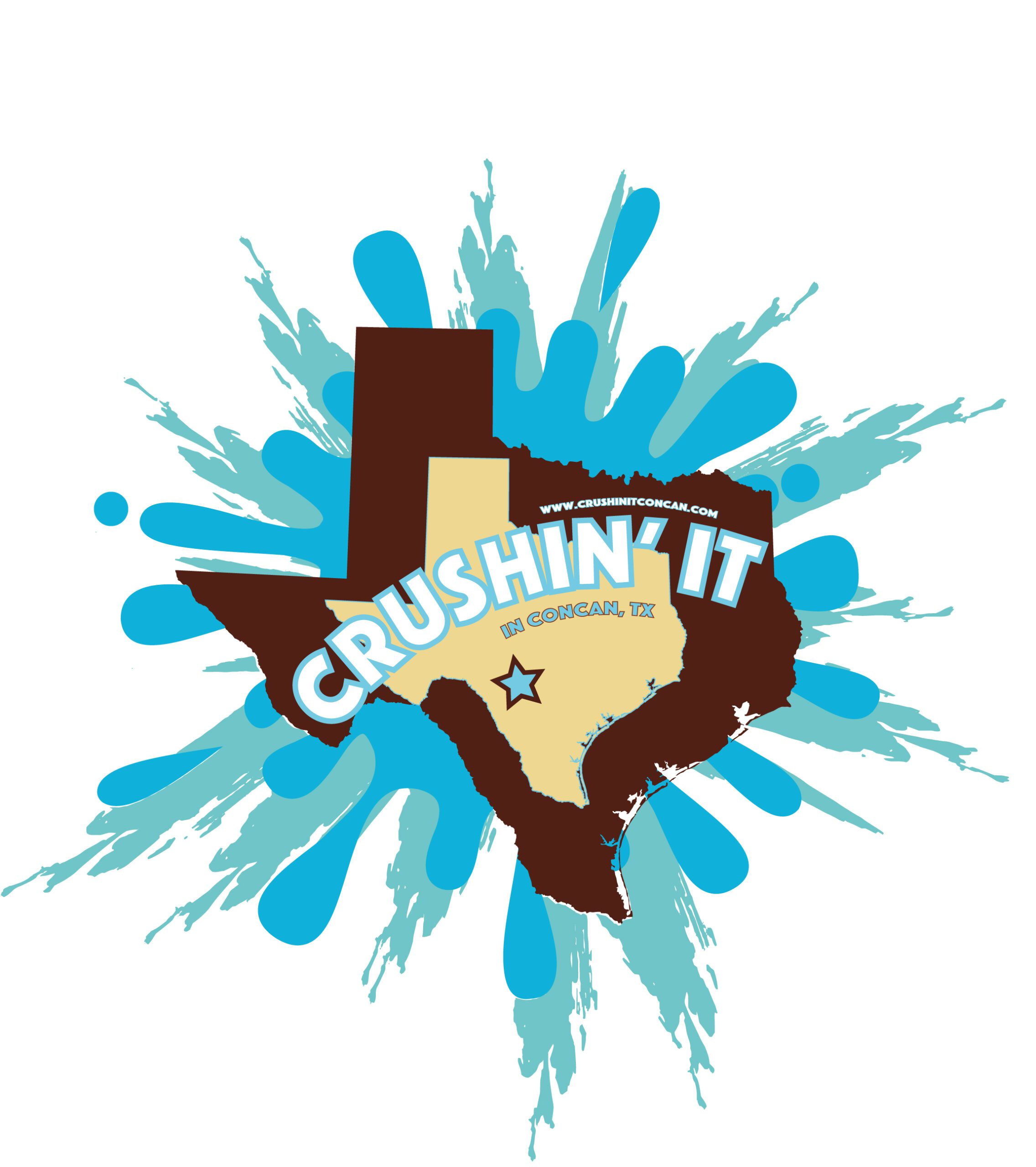
This project required converting an existing “Crushin’ It Concan, TX” artwork into a fully scalable vector design file, ensuring crisp, print-ready quality for merchandise, signage, apparel, and promotional materials. The original logo, featuring a bold Texas silhouette with splash graphics and playful typography, needed to be re-created in vector format while maintaining its energetic, adventurous identity.
A secondary goal was to integrate the client’s website into the design in a way that felt intentional, balanced, and complementary to the overall aesthetic.
Brand Discovery:
Reviewed the existing artwork to understand its personality—fun, bold, outdoorsy, and community-centered. Identified core visual elements such as the Texas map, star marker, retro-style lettering, and turquoise splash background.
Layout & Typography:
Reconstructed each component in vector format using clean paths, consistent line weights, and scalable shapes. Refined the typography to ensure smooth curves and balanced spacing. Determined an ideal placement for the URL that feels integrated without disrupting the logo’s primary focus.
Visual Strategy:
Preserved the original color palette of browns, tans, and turquoise blues while enhancing vibrancy and contrast for improved readability in print and digital formats. Added the website URL along the top arc of the inner Texas shape—creating a natural visual anchor that blends cohesively into the composition.
Production:
Delivered the final artwork as a full vector file (AI, EPS, SVG) along with high-resolution PNG exports. Ensured compatibility for large-format printing, embroidery, vinyl cutting, and merchandise production. The addition of the website URL was seamlessly incorporated without overpowering the existing design.