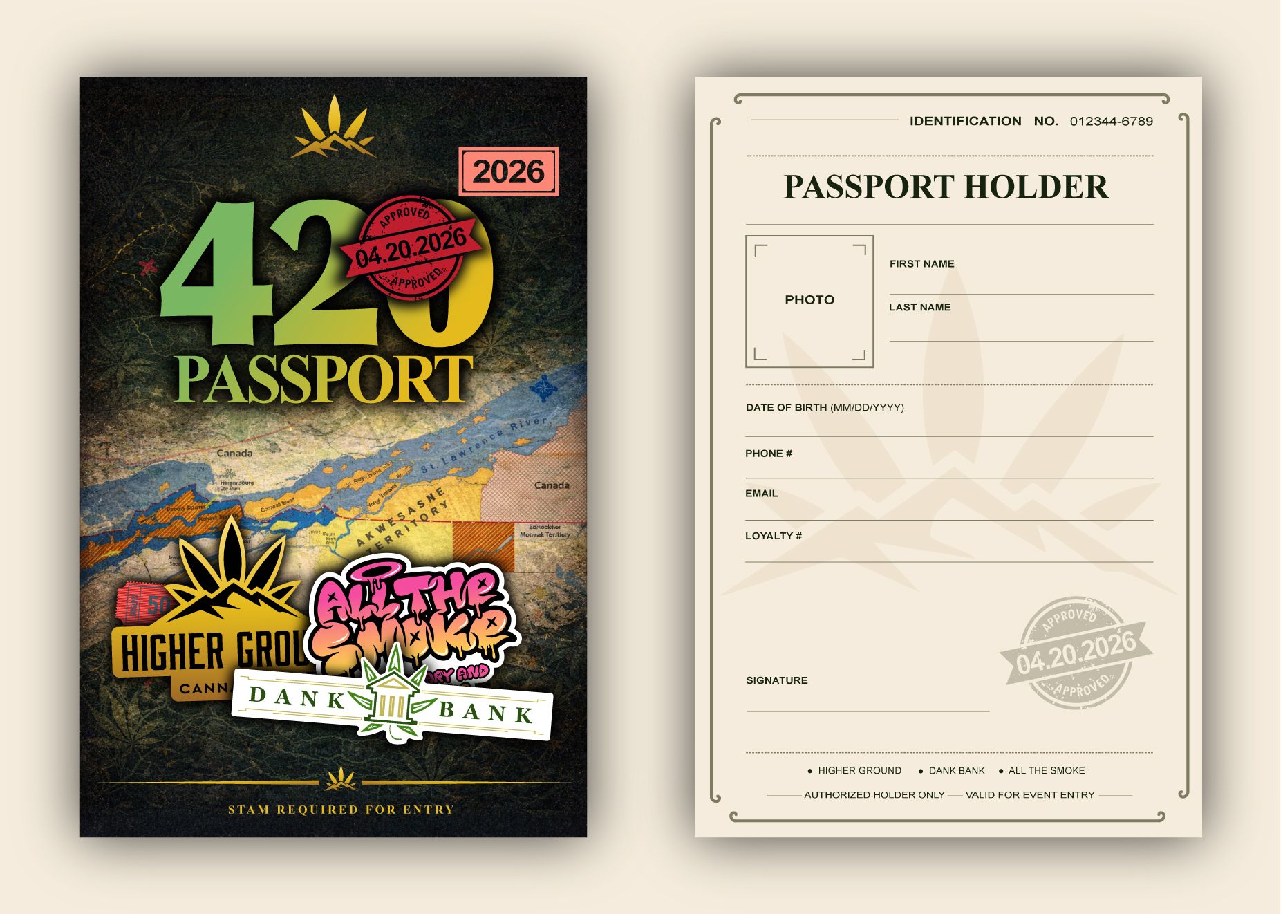
This project involved designing a fully branded event passport system for a 420-themed cannabis experience, combining both a visually striking cover and a functional interior “passport holder” layout. The goal was to create an immersive, collectible-style piece that enhances the event experience while serving as an entry credential, engagement tool, and brand touchpoint.
The design blends festival energy with official document aesthetics, creating a unique hybrid between a travel passport and an event access pass. It needed to feel authentic, interactive, and memorable while incorporating multiple brand identities and event sponsors.
Execution Process
- Brand Discovery:
Analyzed the tone of the event — energetic, cannabis culture-driven, and experiential. Identified key elements such as 420 symbolism, stamp-based interactions, and multi-brand collaboration to shape the creative direction.
- Layout & Typography:
Designed a dual-format system:
• A bold, layered front cover featuring the “420 Passport” branding and sponsor integrations
• A clean, structured interior layout styled like an official passport page for user details and event validation
Used strong typographic hierarchy to balance playful branding with formal document structure.
- Visual Strategy:
Created a textured, collage-style cover incorporating maps, stamps, and layered graphics to evoke travel and exploration. Integrated multiple partner logos while maintaining visual cohesion.
For the interior, shifted to a minimal, official aesthetic with soft tones, borders, and structured form fields — enhancing authenticity and usability.
- Production:
Delivered a print-ready passport design optimized for physical distribution at events. Ensured proper alignment, bleed setup, and durability considerations. Designed for both functionality (entry validation, stamps, data capture) and collectability as a branded keepsake.