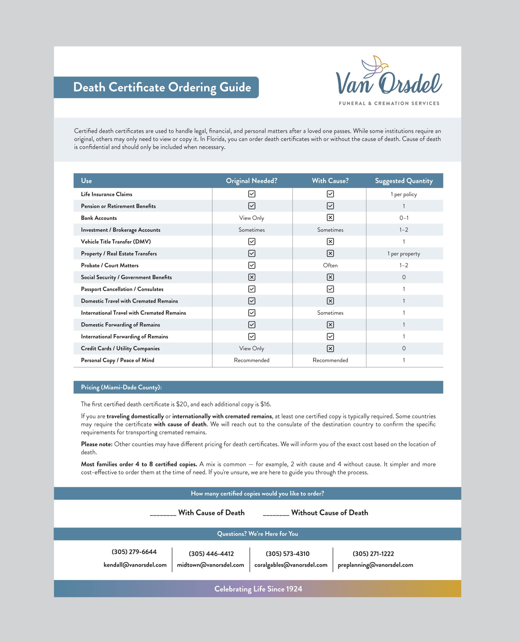
For this project, I was asked to redesign a vital documents request form — specifically, a death certificate order form — to reflect the client’s professional branding and improve its usability.
The existing document was functional but lacked visual consistency and brand alignment. My task was to turn this utilitarian form into a clean, on-brand document that would feel both professional and easy to use, while supporting both English and Spanish users.
Brand-Aligned Redesign:
I matched the form’s layout, fonts, and color scheme with the client’s brand guidelines using a reference PDF provided.
Checkbox Conversion:
Replaced text-based “Yes / No” fields with intuitive checkboxes and X-mark options for better clarity and user experience.
Bilingual Layout:
Created a clean second-page translation in Spanish, mirroring the structure and formatting of the English page for consistency.
Form Readability & Flow:
Improved the spacing, alignment, and typographic hierarchy to make the form easier to complete by hand or digitally.
Print & Digital Compatibility:
Designed for high legibility whether printed or used as a fillable PDF.
This redesign helped the client elevate an essential customer-facing document, bringing clarity, usability, and brand consistency to an otherwise overlooked touchpoint.